What’s In a Name?
May 19, 2012
Names are powerful. Simply changing the name of something can have drastic effects. A name is something concrete that we can latch onto in our thoughts. Without a name, we fumble around. Without a name, a concept blurs. We can sharpen that concept by adding more and more descriptors. Yet, this becomes cumbersome as the descriptors mount. A name embeds all of these descriptors and brings clarity to our thoughts. Consider this exchange:
Your friend: I just saw the weirdest car!
You: Weird how?
Your friend: It was real low down.
You: So?
Your friend: It was a super low, classic car. But, get this, it could hop up and down too!
You: Ah, man. That’s just a lowrider!
You can’t picture a weird car as you’ve seen plenty of weird cars, so the concept is initially very fuzzy. As you get more and more details, the image starts to take form. Once you name it, you have a solid image of it. But you have to be careful. The word “lowrider” not only describes that car, but the driver. It’s a whole culture, and maybe that car and driver are not part of that culture. Using “lowrider” means that you are on one level or another buying into all the assumptions implicit in that term.
This is exploited all the time. To name one easy example, take the “pro-life” moniker. Instead of calling themselves anti-abortionists, the pro-life group has linked themselves to all of human life by embeding the word “life” in their name. They force you think of their cause as defending all of the sanctity of life, which is a very just, noble cause.
Advertising loves to do this. By linking a product name with good traits, whenever you think of that product you associate it with those traits. Will beer really get you into a group sex? Of course it won’t! But if you are exposed to the commercial enough, you’ll link the two on some level. Next time you think of beer, you may think about how it will help you get laid.
Fittingly, if you are aware of this effect you can counteract it and use it for your own ends. In reading, “Universal Principles of Design” I realized just how much advertising uses these design principles. Nearly all of the principles have citations in psychology literature, so by learning these principles you can influence the thoughts of others and be on guard for those trying to do the same to you.
The picture above helps explain why companies seek to expose you countless times to their logo and name. I always thought it was silly that companies would print their name on a pen. A pen? Really, would just putting your name on a pen make me buy a product from you? This principle suggests that it would. Especially when you learn about the exposure effect, which is that subjects exposed to a neutral stimuli will grow to like the stimuli. So by simply exposing us to a corporate logo over and over again, we grow to like that logo. And for good measure, throw in some classical conditioning, where a stimulus is associated with an unconscious physical or emotional response. The aforementioned commercial conditions us to like the beer by associated it with fantastic sex. These three principles make it so that when we walk down the beer aisle, we recognize the brand, we unconsciously like it, and then we buy it. These principles go a longways towards explaining why our lives are so saturated with ads.
I would encourage you to check out the book. It’s really gorgeous and well done. There are a hundred concepts, and I only knew maybe fifteen of them by name. I knew about half of them on some vague level, but now that I have a name for them I can exploit them and be on guard.
I’d like to finish this with one last example on the power of names and their baggage. In my lab group, we come up with models that we name. We usual name them on the day they are finished. So when we finished a model on the fifth of November, it was christened Guy Fawkes. Clearly, we should have thought a bit harder as our British sponsors are less than amused!
Aside
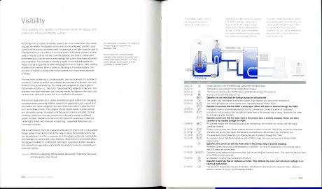
Sorry, but as a chemical engineer, I wanted to share the above spread. In one of my classes, someone presented on 3 Mile Island. He did a terrible job, and I had forever been confused. This nicely summarizes the events of that day and explains how visibility could have prevented the near disaster. The book also includes factor of safety as a principle and cites the Challenger disaster as an example of what not to do. Clearly, a little bit of good design can stave off serious problems.
Mediocre Modernity
May 13, 2012
 I’m a sucker for zombies. The first movie I can ever remember seeing is Tom Savini’s color remake of George Romero’s “Night of the Living Dead”. Maybe this has indelibly imprinted my tastes, but whatever the reason zombies pique my interest. Now, I’m not the only one. Zombies are something of a fad at the moment. This piece is from 2010, but I think it still holds as “The Walking Dead” marches on accompanied by a horde of movies and books.
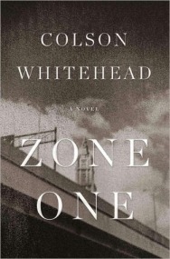
Initially my love of zombies grew into a love for all things horror. I watched far too many horror movies as a kid. I remember being terrified by Chucky, Puppet Master, Jason, and Freddy. However, my tastes have matured. I now prize characters above extraneous action. So that meant when I read a review of Colson Whitehead’s “Zone One” that said it would disappoint zombie fans due to its focus on thoughts and life rather than braining corpses, I knew I had to read it.
This post will contain “spoilers”, but if a work of art can be spoiled it isn’t very good now is it? Anyway, I will be discussing matters that are not revealed until the end of the book, so caveat lector!
While this is indeed a zombie book, it is a zombie book in the vein of the comic series “The Walking Dead” in that the zombie apocalypse is a backdrop allowing the protagonist to examine life more clearly. The lens for our examination is Mark Spitz, who is self-admittedly mediocre. Mark Spitz is on a team of sweepers who have been assigned to Zone One in what was New York City. The marines have already cleared out the active zombies, and all that remain are stragglers. These stragglers are harmlessly catatonic skels. The sweepers simply drop ’em, bag ’em, and drag ’em outside for disposal to take care of. This is the day-to-day grind for Mark Spitz and his team, and as they go about their work Mark Spitz thinks about his life and the stragglers.
There are so many things I would love to talk about. The recurring image of the Uncle’s building, why the lieutenant opted out, the ruminations on the stragglers, corporate-sponsorship for the recovery, PR branding of recovery (the American Phoenix), the beautiful imagery of the ash, the pacing, etc. This goes to show how excellent the book is. I’ll limit myself to the themes of mediocrity and race.
The strongest theme in the book is how Mark Spitz’s resilient mediocrity makes him an ideal survivalist in this zombie-infested world. This taps into what zombie-ism is all about. Zombies are all equal. No matter their former station in life, every zombie is just as weak, stupid, and ravenous as every other zombie. This point is hammered home when we see the ocean of skels pressing against the wall. We see people from all walks of life, and they are now indistinguishable drops of water in this undead ocean. Interestingly, all of the survivors independently start referring to the undead in terms of weather. This shows how the undead are a backdrop, allowing the story to focus on the living and life.
In a world that is now dominated by the zombie natural force of mediocrity, Mark Spitz has the strongest advantage as he is and has always been hopelessly mediocre. Mediocre grades (straight B’s), mediocre job (online PR for Starbucks), mediocre life (no girlfriend and still living with his parents). So despite his lack of survival talents, Mark Spitz makes it through Last Night and outlasts many companions.
In listening to survivors’ tales, what you hear the most about is what they were thinking and feeling. How they kept things together. So while Mark Spitz does not possess an edge in survival skills or physical ability, his mediocre mentality keeps him alive. Whereas the brave and daring risk too much, whereas the cowardly and meek risk too little, Mark Spitz risks just enough. Furthermore, as he has always been mediocre, he is actually comfortable among the dead, unlike some of his companions who snap or commit suicide.
The idea that mediocrity is a benefit in this undead world is unique. It makes you wonder how mediocrity pervades modern life. Mark Spitz does a totally worthless job. He meets someone who has a similarly worthless job, scripting the cut scenes for video games. Most of the character’s former jobs are worthless. The world could easily be rid of them without a problem. How many people waste their time on a worthless job today?
The other interesting theme I want to talk about is race. When you are nearly done with the book, you find out that Mark Spitz is black. This stopped me. And then made me ask myself why I stopped. Why does it make such a difference? I can easily point to how it changes the dynamic of the sweeper team he is on, as Mark Spitz is paired with a presumably racist redneck. I can also say how it shifts other survivors’ views of him and affects their decision to welcome or to avoid him. No matter what I say, I still cannot put my finger on how it permeates the novel. It’s something I will continue to think about.
In a larger context, our society is still very racially divided. In the apocalyptic world of “Zone One”, people from all different socioeconomic and racial backgrounds work together against a common enemy. I hope that the author doesn’t think we need such a drastic measure to unite. Although, given the recent issues of Trayvon Martin and Rue in “The Hunger Games” we may need something so earth shaking.
While I highlighted the two themes that resonated most with me, the novel is multifaceted. I think it portrays a depressingly realistic view of what the undead world would be like. To lighten the mood, I want to leave you with a humorous quote from it. Mark Spitz is ruminating about his old job, where he haunted social media for any chance to hawk Starbucks. When people posted things like “I’m exhuasted,” he would reply back, “Sounds like you need a hearty cup of Iced Number Seven!” He thinks how that job would be in this new world. “Nothing cures the Just Got Exsanguinated Blues like a foam mustache, IMHO.”
Steer Clear
May 8, 2012
Just a quick PSA for technical folks: Technical Presentation Workbook: Winning Strategies for Effective Public Speaking is a terrible book. I read the first hundred pages of it, and then simply gave up. Think back to your high school books. Cheese ball humor. Weird cartoons floating off to the sides of the text. Now combine that with the most basic advice possible on how to present written primarily in bullet points. To cap it off, it’s a workbook. So after every gem of wisdom there’s a sheet for you to fill out on how it applies to your talk. Skip this book if you want to learn how to present.
Two Ways to Easily Improve Your Graphics
May 5, 2012
Having been thoroughly impressed by Edward Tufte’s first book, The Visual Display of Quantitative Information, I decided to pick up another, Visual Explanations. Tufte envisions his books fitting together like so: The Visual Display of Quantitative Information is about pictures of numbers. Envisioning Information is about pictures of nouns, and Visual Explanations is about pictures of verbs. I was not drawn in by Visual Explanations (VE) as I was by The Visual Display of Quantitative Information (VQ). VE felt disjointed, and the lessons learned are less applicable for graduate students. However, there are still two very important lessons I gleaned: be subtle and avoid legends.
In a nutshell, VE states that images should be honest and scientific. Images should lend themselves to easy comparison through similar composition and repetition. Lastly, images alone can make an argument or tell a story through juxtaposition and symbolism.
I want to highlight a couple of these lessons, starting with one that I initially thought was wrong.
Tufte states, “Make all visual distinctions as subtle as possible, but still clear and effective.” I would think you would want to eschew subtly to make sure the point comes across. However, this can be far too overwhelming, as shown above.
I’ve seen this lack of subtlety in lab presentations where the presenter shows a chart with ten or more curves. Every curve is a different color and has different markers for the points. Either a different color or a different set of markers would suffice, but both is excessive. Adding insult to injury, the default Excel colors are garish and unsubtle. To fix my own graphics, I’ve taken to using shades of black and gray to differentiate between each curve.
That same chart had a legend. Imagine trying to look at the legend, then the curves, then the legend, then the curves, then the . . . I simply gave up. You might think I give up too easily or that I am nit picking, so I’ll let you experience the difference between a legend and direct labeling for yourself.
In light of this striking difference, I always label my curves directly. To do so in Excel, do not use a text box. Use a data label. You can overwrite the label and move it anywhere in the graph, so it is just like a text box. However, unlike a text box the label will stay in the same relative place on the graph and rescale along with the graph.
The most important message for me is the same message Tufte stressed in his previous book. Graphics should be honest and scientific. To make a graphic honest, there must be a sense of scale and orientation for the viewer. If time-averaging or area-averaging has been applied, it should be done carefully as it can easily obscure important trends. The graphic to the right illustrates how area-averaging may doomed the residents of Broad Street. To make a graphic scientific entails quantification, comparison, and investigation of cause-and-effect. Quantification means applying a scale and going further to assign numbers to seemingly qualitative data. Comparison means plotting similar graphs on the same scale so that when they are put side-by-side, a line falling an inch in one means the same thing in the other. Investigation of cause-and-effect is the most difficult, but it means always plotting the suspected cause on the X-axis and the effect on the Y-axis, rather than plotting both against time.
Tufte does a fantastic job illustrating his message through the Challenger explosion. This is definitely a favorite case-study of his as it shows up in at least three of his books. Here he shows the actual set of slides the engineers sent to NASA the night before trying to persuade them not to launch. Tufte dissects the slides to show why they failed to persuade. The slides omitted many critical data points, failed to quantify the extent of damage to the O-rings, and presented important comparisons with many slides in between. At the end of the dissection, he shows the graphic below.

The slides only discussed the two labeled data points. This shows the full trend and makes a case for cold being dangerous.
By creating a damage-index, Tufte quantifies the data that was previously only qualitative. By plotting this data against temperature, Tufte makes a case for cold temperatures causing damage. I think that if this graphic had been shown to NASA, the launch would have been postponed.
While not all design decisions involve life or death, design can make or break the viewer’s comprehension of your argument. Taking the time to make your graphs easy to read will lead to better questions from the audience. Better questions will push your research along more quickly. Or maybe good design will help a grant-reviewer understand your argument and see why it is significant. In any case, this is not a small matter. While content is definitely king, it must be presented in an intelligible manner for it to take over the kingdom of the viewer’s mind.


